How we created Flatiron Open Source - Frontend
Flatiron School
Flatiron School is a 15-week coding bootcamp, with courses in software engineering, data science, cybersecurity, and product design.
Upon completion of the course, students lose access to the internal class portal, called Canvas. Students are provided with html and javascript data files, containing information on the modules and courses used throughout the phases of the bootcamp.
Flatiron Open Source
The challenge we Hope, Ian set out of accomplish is how to make the data provided upon graduation user friendly for future review and preparation for interviews. This is what sparked the idea for Flatiron Open Source. The goal was to recreate the internal class portal for Flatiron graduates to use and collaborate.
This blog will run through the process to create the front end, while future blogs will discuss back end and user implementation
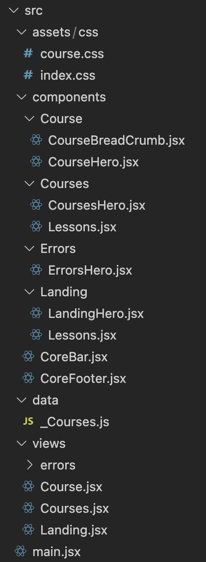
How we structured our front-end
assets/css
- css setup and configuation with tailwind
components
- This is where the site components are created for the specific site modules. Information has been passed down using params.
data
- Used for params for routing to the correct links to the backend
views
- This is where the components are rendered. Items from the components page are imported into views.
main
- The main jsx file that gets rendered for the script for index.html. The views are imported into main, where react router is used to move through the different data.

Tailwindcss/DaisyUI
CSS styling was completed using the DaisyUI plugin for TailwindCSS. The inclusion of DaisyUI makes creating components seamless, and if needed allows for customization.
To get started, you must have the runtime environment, Node.js, installed, to use the package manager npm commands. Another option, which was used for this project, is to have yarn installed on your computer.
The documentation for tailwind can be found here
Step 1 Install the required packages
yarn add -D tailwindcss postcss autoprefixer
yarn tailwindcss init -p
yarn add daisyui
yarn add react-daisyui
Step 2 Set Up your tailwind.config.js files
Source code for Flatiron Open Source tailwind.config.js file can be found here
The most important piece of the source code is the additional plugin to require daisyUI.
Step 3 Add the Tailwind directives to your CSS
Source code for Flatiron Open Source tailwind directives can be found here.
That is all you need to do. The final piece is the read the documentation, and import DaisyUI components you would like to use to make styling seamless for your project.
Client Side Routing
In a React application, client-side routing refers to the process of navigating to different pages or views within the app by updating the URL in the browser, without triggering a full page reload. This allows for a smoother and more efficient user experience, as the app can quickly update the displayed content without having to fetch it from the server.
One popular library for implementing client-side routing in a React app is React Router. React Router provides a collection of components that can be used to declaratively define the different routes in your app and the components that should be displayed for each route.
Vite is a build tool that is well suited for building SPA (Single-Page Applications) with React, it provides a fast development experience with a simple setup, it also provides built-in support for client-side routing by using ES modules and it's live-reloading feature.
You can use Vite with React Router to handle client-side routing in your app. You'll need to install React Router;
yarn add react-router-dom
Then import react-router-dom to your main.jsx. This is our example;
import React from 'react';
import ReactDOM from 'react-dom/client';
import {BrowserRouter, Routes, Route} from 'react-router-dom';
import './assets/css/index.css';

// Routes
/* Landing Pages */
import Landing from './views/Landing';
import Courses from './views/Courses';
import Course from './views/Course';

/* Error Pages */
import NotFound from './views/errors/NotFound';

ReactDOM.createRoot(document.getElementById('root')).render(
  <React.StrictMode>
    <BrowserRouter>
      <Routes>
        {/* Landing Pages */}
        <Route path="/" element={<Landing />} />
        <Route path="/courses/:course" element={<Courses />} />
        <Route path="/course/:course/:phase" element={<Course />} />

        {/* Error Pages */}
        <Route path="/*" element={<NotFound />} />
      </Routes>
    </BrowserRouter>
  </React.StrictMode>,
);
IDs and courses.js
Now you might ask, what is this;
<Route path="/course/:course/:phase" element={<Course />} />
We are using useParams react hook from react-router-dom to recieve data from URL. :course is course ID like product-design so we can request related data from courses.js.
The useParams react hook allows for dynamic routing, in this case used for the url slug. It also helps to dynamically render the correct data for the course page.
Why Vite 3
In most React applications, software engineers use the command below to scaffold React projects:
create-react-app <app-name>
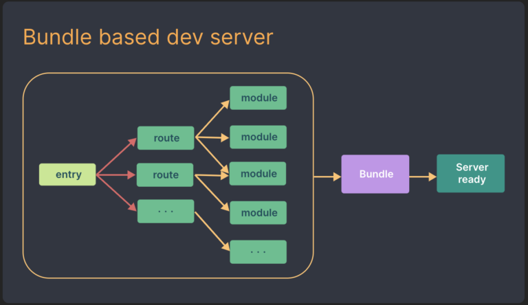
The downsides to this command is speed. Create-React-App is a bundle based development server. It uses webpack, which bundles the application code before serving. The larger the codebase, the more time this will take.

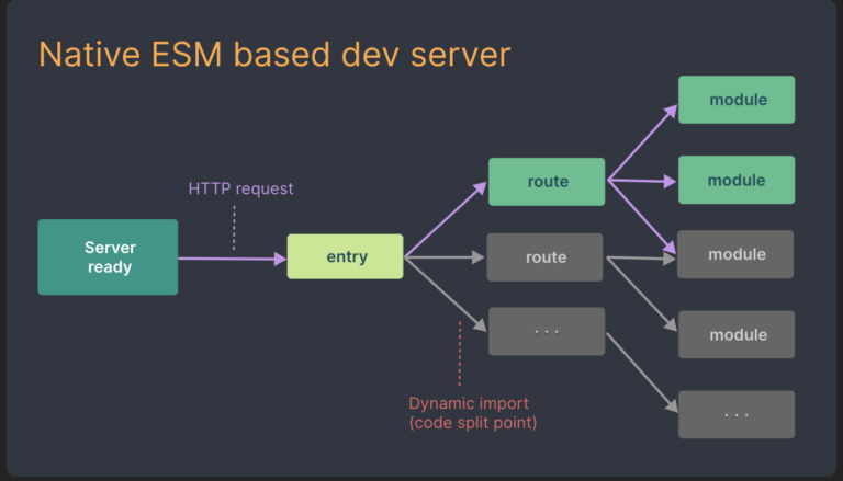
Vite is a front-end Native ESM based development server with several advantages over create-react-app:
- It takes advantage of the availability of native ES modules in the browser, and the rise of JavaScript tools written in compile-to-native-languages
- Vite enhance start time by dividing the modules in an app into dependencies and source code
- Dependencies: plain JavaScript that does not change during development (component libraries). Dependencies are pre-bundled using esbuild.
- Source Code: non-plain JavaScript that needs transforming (JSX/CSS components). Source code is served over native ESM.Vite only serves source code as the browser requests the data and the data is currently being used. -Vite supports Hot Module Replacement (HMR) over native ESM. When a file is edited, VITE only needs to invalidate one chain between the edited module and the closest boundary, instead of re-constructing the entire site as a bundler

The documentation found here will help you start a project with vite.
yarn create vite
yarn create vite my-react-app --template react
Google Analytics
vite-plugin-radar is a Vite plugin that allows you to easily add Google Analytics and Google Tag Manager to your website.
To use the plugin, you'll first need to install it as a dependency:
yarn add vite-plugin-radar
Then, you need to register it in your vite.config.js file:
import {defineConfig} from 'vite';
import react from '@vitejs/plugin-react';
import ViteRadar from 'vite-plugin-radar';

// https://vitejs.dev/config/
export default defineConfig({
  plugins: [
    react(),
    ViteRadar({
      // Google Analytics tag injection
      analytics: {
        id: 'G-QYFSS4RFJQ',
      },
      gtm: {
        id: 'GTM-TTWKD6W',
      },
    }),
  ],
});
Here, analytics is your Google Analytics tracking code, which is used to track the user's actions and behavior on your website. gtm is your Google Tag Manager container code, which is used to manage your analytics tags.
Once this is done, the plugin will automatically add the required GA and GTM scripts to your HTML page and configure them based on the options you provided in the configuration.
Please note that The plugin is in beta state and its API might change, you might want to consult the documentation of the plugin for the most up-to-date information.
Responsive Design
Responsive design is a method of designing and building websites that adapt to the different screen sizes and devices that people use to access the web. It's important because more and more people are accessing the internet from a variety of devices, including smartphones, tablets, laptops, and desktops.
Tailwind CSS is a popular utility-first CSS framework that can be used to build responsive designs. It provides a wide variety of utility classes that can be used to apply CSS styles to HTML elements quickly and easily. These classes are designed to be highly composable, which means you can use them together in different combinations to create complex layouts and designs.
One of the ways Tailwind CSS helps with responsive design is through its use of "responsive prefixes" that can be added to utility classes. These prefixes allow you to apply different styles to an element based on the size of the screen. For example, you can use the "sm" prefix to apply a style only when the screen is at least 768 pixels wide, or the "lg" prefix to apply a style only when the screen is at least 1280 pixels wide.
Keep in mind that, as with all utility frameworks, it can be harder to maintain when trying to customize complex design, for that reason is recommended to use it in conjunction with a css-in-js lib or some custom css that complement the design. So don't forget to check out TailwindCSS's documentation for up-to-date information.